For far too long, the gun industry has been insulated from the natural consequences of its deadly products. We have been tasked with showing the world how gun makers and sellers innovate toward danger, irresponsibly market their wares, and arm criminals.
A Compelling Brand Identity
To command attention, we needed a striking and gritty tone, so our design team created a new logo and brand identity by deriving inspiration from investigative journalism, and the process used by corporate and government bodies when they redact confidential documents. The brand elements have a rough, degraded appearance, resembling documents that have been repeatedly photocopied, redacted, and pieced together with news articles and other miscellaneous research artifacts.
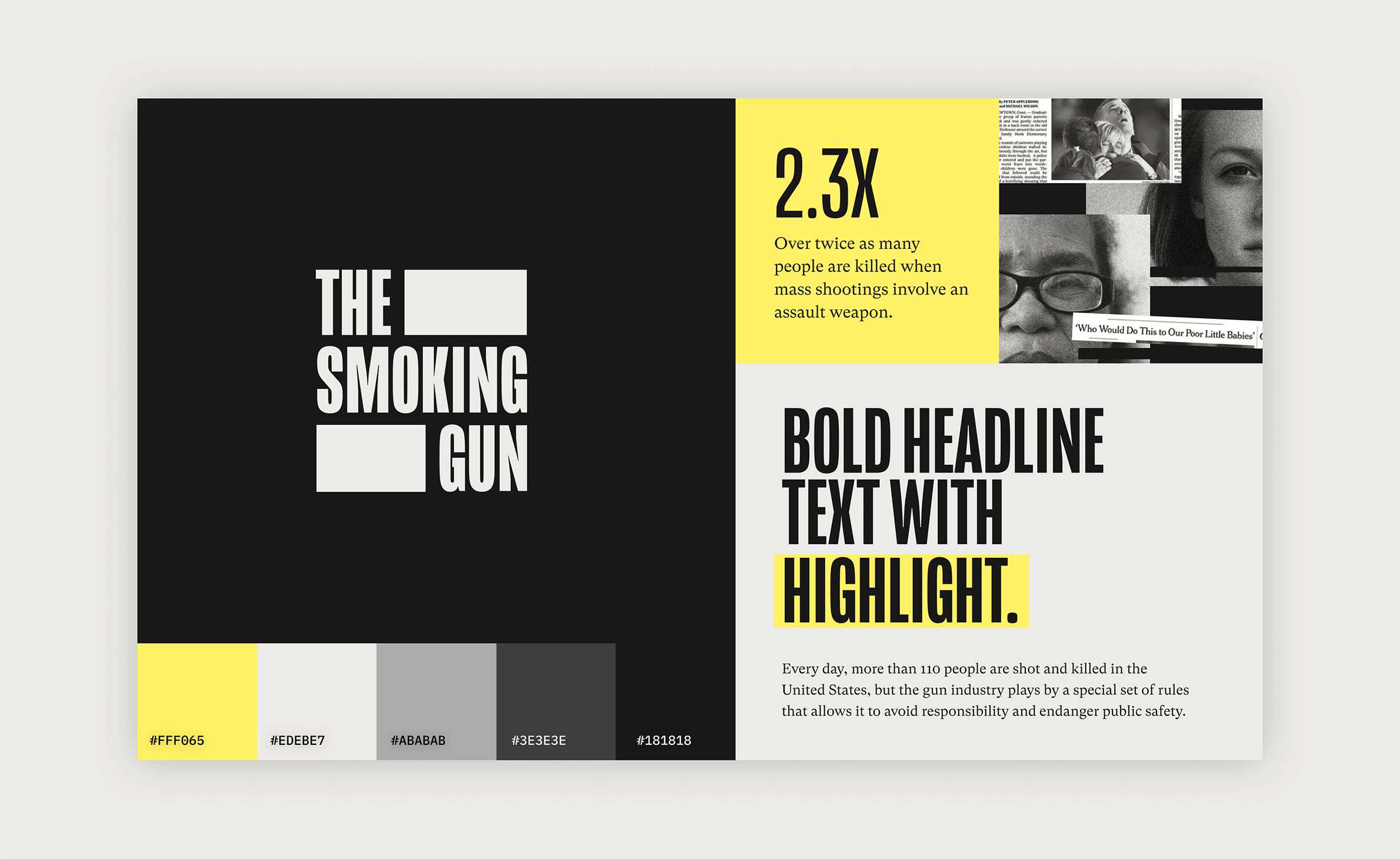
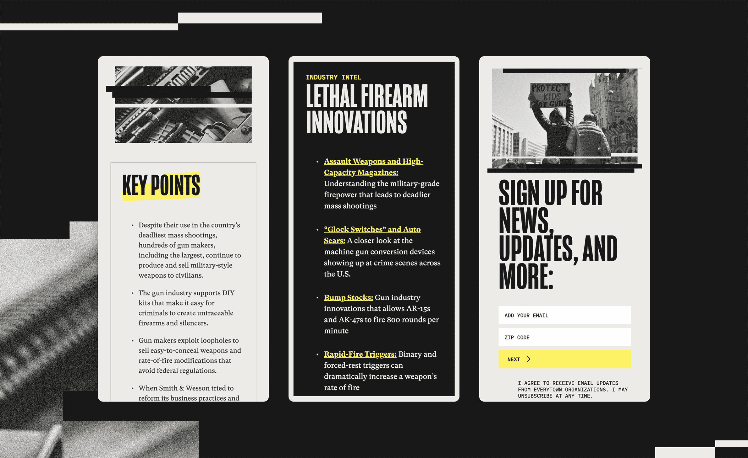
Photographs stripped of color convey a more solemn tone. The texture or graininess in these photos stands in stark contrast to the striking typography and vibrant yellow accents. This effect also draws a parallel to television static and the incessant “noise” or coverage of gun violence that we are frequently exposed to in the media.
User Experience Challenge
- Arranging and formatting diverse content types – such as statistical data, evergreen content, ongoing updates, opinion pieces, etc. — to ensure that the information is not only easily accessible, but also simple to comprehend.
- Motivating audiences to delve deeper into the main topics.
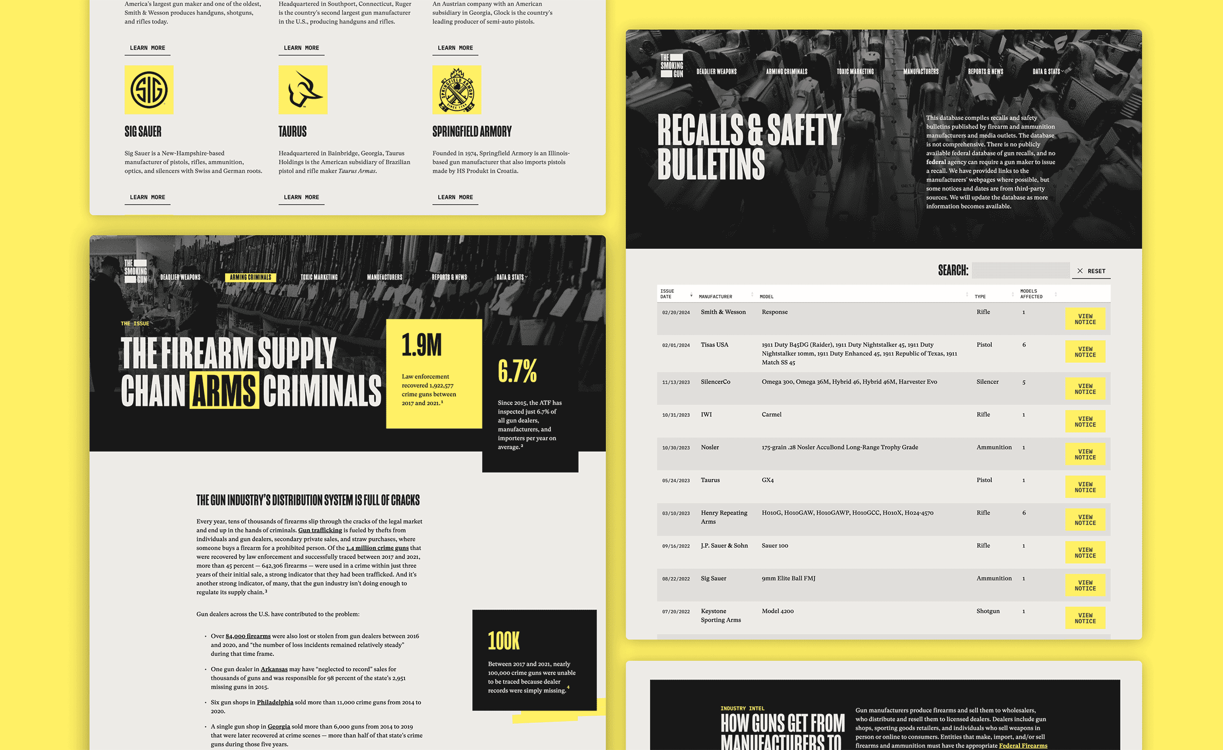
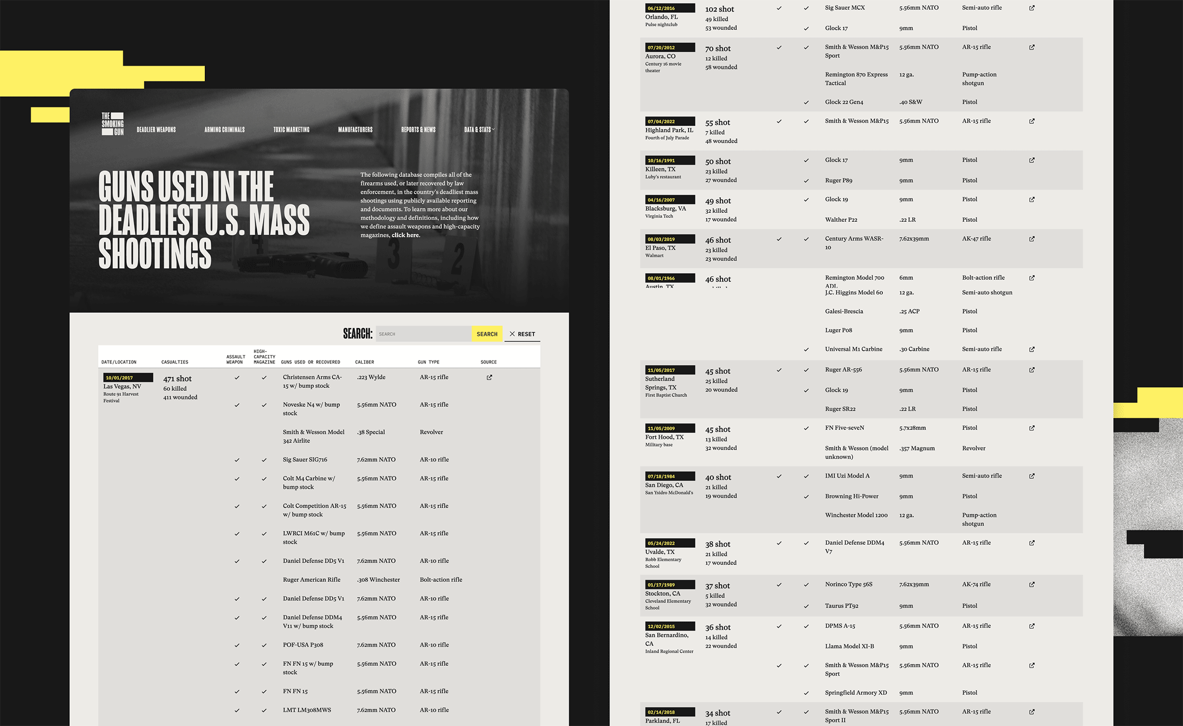
- Designing user-friendly data tables that draw from highly complex sources, and ensuring they are easily viewable on mobile devices as well.
- Construct a website that offers administrative flexibility for a wide variety of content lengths.
- Emphasize the compelling data and provide citations.
User Experience Solution
- We initiated with a topic-based navigation, which linked taxonomies between reports, news, and manufacturers. This model enables users to trace a trail of relevant information across the site.
- To increase user pathways, we included call-to-actions and inline links throughout the site.
- We constructed the website using a select range of flexible components. Our experience has taught us that an abundance of components can be overwhelming for content editors. By limiting this number, we ensure authors can efficiently publish their content, while the user interface remains consistent for all audiences.
- The data tables have a unique “sticky header” that adjusts effectively to fit mobile screens.


