Does Flyout Navigation Really Confuse Users?

I’m the guy here at Allegiance Group + Pursuant who, more often than not, codes the HTML pages that turn your elegant, professional, or enticing new site design into dynamic, active, enticing Web pages. It happens between the designer working in Photoshop and our crack development team building the site in whatever CMS you choose.
I love coding pages. Each design brings new challenges, and figuring out how to bring the collaboration between the client and design team to a glorious clickable life is always fun for me. As Web design becomes more mature and sophisticated and the technologies available to us become more dynamic and interactive, this job gets more interesting.

Lately, most sites we’ve designed, built, or both have called for some “flyout” navigation (Bread for the World, AFSCME). An aside: some people call this kind of navigation “dropdowns,” but I feel that suggests that a click might be involved (as in dropdowns in online forms), whereas the word “flyout” more specifically describes something that appears when you move your mouse over an object. So, for this post, I will now dispense with the quotes around the word and refer to flyouts.
I’ve recently begun to question the wisdom of using flyout menus in most cases. Primarily, this is likely a result of being forced to use so many poor implementations of flyout navigation and the annoying way they can behave when incorrectly done. For instance, some flyouts incorporate excessive whiz-bang effects (fade in and out and otherwise act in ways that get in the way of the user quickly deciding what they want and getting to it). But even when done correctly, incorporating a well-thought-out site architecture, and concerning accessibility requirements, I believe that flyout navigation may not accomplish what we hope it does.
First, a little about my personal experience as a user of sites with flyout navigation: I can’t stand to have menus open, as flyouts do when I don’t want them to. In all the other applications (browsers, office products, music players, design programs) I use, menus stay where they are until I click on them. The way that flyout navigation comes bursting into view every time my mouse travels over them (usually on my way from typing in the address of a page to clicking on something I’m actually interested in) is jarring and annoying to me, and I often am then forced to waste time moving my mouse somewhere else on the page to get rid of the menu that has obscured what I wanted to see in the first place. Menus, in my humble opinion, should stay put until I tell them otherwise. Moving my mouse across the screen is not an action. Clicking is an action.
Jeffrey Zeldman and I dislike flyouts for many of the same reasons, but Jeffrey also bases his opinion on his personal experience as a user. His argument that flyout menus are an indication that the Information Architecture was arrived at poorly and with an unwillingness to “…think through the organization of the site’s material into a user-focused structure” sounds exactly like what I’ve said over and over, but in many ways feels more like an unearned prejudice to me regarding the work we do at Allegiance Group + Pursuant because we put a lot of work into the information architecture of our sites through many different methods: card sorting, heuristic evaluations, personas, usability testing, to name a few common ones.
Zeldman says flyout menus “…almost always create an inferior user experience versus drilling down through clearly labeled, intelligently organized categories.” Here, I completely agree. If you have taken the time to arrive at a solid information architecture and have built pages that are clear and easy to navigate, the experience of moving through that architecture to your ultimate goal carries with it far more advantages (more on that later) than what I see as the sole strength of flyouts which is to get you to a goal more quickly.
But this is all subjective, and I’m looking for empirical evidence. Where is a usability study that will tell me exactly what I need to know? Well, it turns out that there is not a huge amount of research on the subject, but there have been a few interesting studies that touch on it and may inform our decisions about flyouts.
In a paper presented at the Usability Professionals Association (UPA) 2005 Conference in Montreal, a group from Fidelity Investments in Boston described their process and how they ended up choosing horizontal flyout navigation – which they call “dropdown” as opposed to “flyout” from six options:
- Yahoo-style menu
- Rollover menu
- Flash menu
- Expand/Contract menu
- Drop-down menu
- Fly-out menu
While the results of their “time on task” and “subjective ratings” tests showed no significant difference between the six types of site navigation they tested, the users of flyout navigation made significantly fewer errors.
“The Yahoo-style and Drop-down menus resulted in significantly lower error rates than the other navigation methods (“Errors” include the cases when participants gave no answer). Since these results showed significant differences between the methods, we used these data as a primary factor in our decision.”
They also noted that the vertical flyout navigation with sub-menus appearing to the right introduces increased errors “when users attempt to select a sub-menu item and mistakenly move the mouse over another menu item.” Yup, that’s me for sure!
This would certainly suggest that flyout navigation is preferable. Ok, so what else is there?
Two studies from User Interface Engineering (UIE) are particularly interesting in helping provide information about whether flyout menus are accomplishing what we think they are. These studies are five and seven years old and, therefore, don’t account for changes in user behavior since then, which there surely are.
Given that the number one reason we hear from clients who want flyout navigation is that it will save steps for users trying to get to information on second or third-level pages, we should probably look at whether more clicks are necessarily a bad thing. This UIE study on the Three-Click Rule concludes that task length does not affect user satisfaction. Instead, though many users complain about the number of clicks it takes to find things, UIE has concluded that these complaints from users are “…really complaints about failing to find something.”
In other words, users are happy to click toward a goal as long as they remain confident that they are, in fact, getting to their goal. The content they encounter along the way will help them determine if this is, in fact, true. At each new page the user arrives at the next level of options exist within a more meaningful context than simply a relationship of labels within a list.
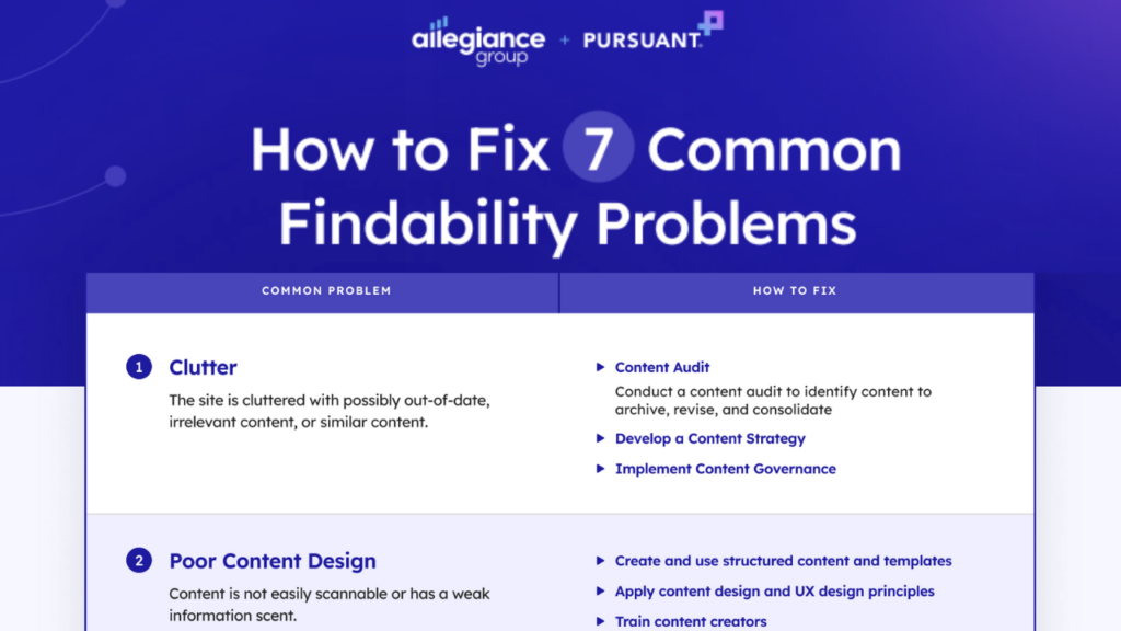
Uncover 7 common UX problems for nonprofit websites and how to fix them.
If it’s true, as the UIE study concludes, that more clicks are acceptable as long as the user can get where they want (and this is what we strive to accomplish when designing a good Information Architecture), why should we risk losing this meaningful context?
We know from experience that arriving at a good, well-thought-out information architecture is difficult and imperfect. We come up with the best labels for sections, subsections, and pages that we can, but given the subjective nature of how people see these labels, we are assuming more than we should be comfortable assuming about the meaning they will take from these labels. To remove them from an overall context that will help imbue them with the meaning we want them to have seems counter to what we should be doing. Without the context provided by content, the hierarchy of navigation labels bears the weight of much more responsibility for communication than it may be able to provide.
In another study from UIE, they find that users decide what they will do upon arrival at a site before they ever move their mouse. Not only are they unable to use the information hidden in flyout navigation during this critical moment of decision-making, but the presence of flyouts can interrupt and confuse this process, resulting in a loss of the confidence the menus intended to provide.
“In our studies, we observed that once users realized there was more information available to them, they stopped and re-evaluated the screen. Users seemed disoriented by this disruption in activity and they lost confidence that they were clicking in the right places. The users now questioned a choice that seemed to be a good one earlier.”
Is it possible that, though we feel that through the use of flyout navigation, we are giving users more information about what is on a site, we are, in fact, hiding that information from them at the most critical time that they spend on our site, and solving a perceived problem (number of clicks) that actually should be addressed during the development of an information architecture? If indeed the number of clicks is not a problem, why introduce a potentially irritating element that a) users don’t even use at the time they are deciding where to go, and b) could remove our labels from a more meaningful context?