352%
increase in donation form pageviews
17%
increase in event sign ups
The Challenge
MS Canada approached AGP to conduct extensive research to better understand their website users’ needs. Our research—including data analytics, web surveys, and focus groups—uncovered an interwoven set of key, actionable insights. First, the need for openness and transparency was paramount. MS Canada’s brand felt scattered, disjointed, and chaotic. Users were looking for clear pathways to explore MS Canada’s programs, services, and other offerings on the new site.
We needed to declutter and simplify the visual and verbal language, which was crucial as our research reflected that people living with MS suffer from intellectual strain and neural fatigue. Also clear was recognizing the diverse nature of MS and emphasizing the many ways MS Canada can help under a single focus: a world free of Multiple Sclerosis. Lastly, our findings revealed that professionalism and intellectualism might be clouding the desired human connection. It was time to reconnect.

The Solution
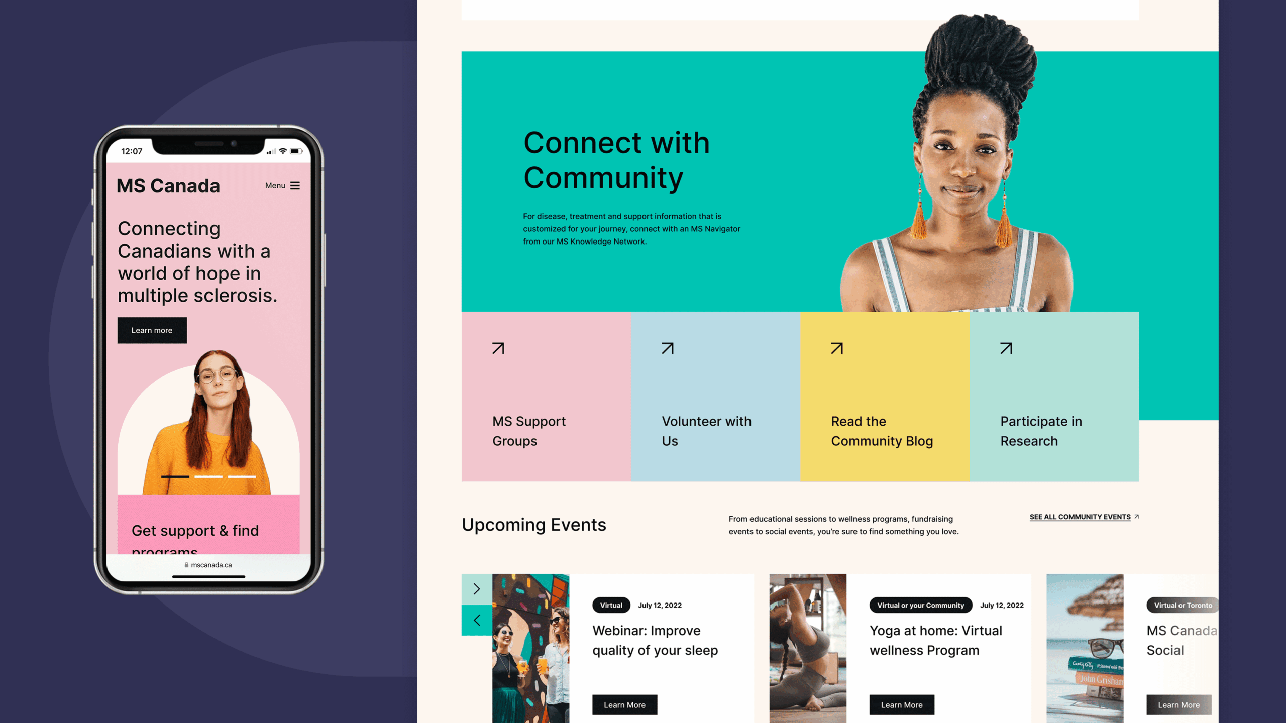
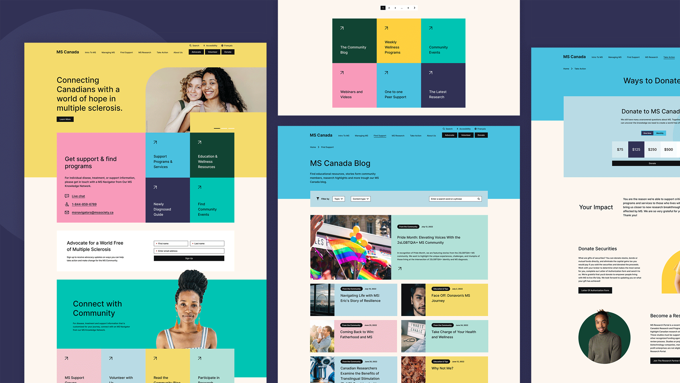
Building on our user journey discovery work and brand identity work created by lg2, AGP launched a full custom website redesign to bring the new MS Canada brand to life. Simple and clean, the layout provides users with valuable information quickly. Our team designed and built a unique Homepage hero space with branded “points” and “connector” elements from the new MS Canada brand guide.
These translated from conceptual, storytelling devices from the new brand into compelling, responsive container shapes that can be exchanged with new content and varying background colors via CMS.
The new branding did not emphasize one color over another, so our creative team intentionally designed layouts to include the full, balanced, and vibrant palette—reflective of the diversity and vibrancy of MS Canada’s audiences.
The AGP technology team also ensured that MS Canada could edit and manage the new dynamic, robust site with ease.

The Result
MS Canada can better serve the diverse MS community. The new modern, polished branding and retooled website provide a simplified user experience with clear, compelling content and an easy-to-navigate design—bringing human connection while maintaining MS Canada’s single focus: a world free of Multiple Sclerosis.
Built in Drupal 9, the bilingual website launched in Spring 2023.


