How To Create A High Performing Donation Form
Optimize your nonprofit organization’s donation page to give visitors a better user experience and maximize your online fundraising revenue.
As fundraisers, we spend so much time developing the perfect campaign strategy, identifying the ideal audience segmentation, and targeting and drafting the perfect copy and creative assets. Why do we spend so little time ensuring that our supporters have the perfect online giving experience?
Here are tried-and-true tips and best practices for donation page optimization, creating the ultimate donor experience that will yield the best results for your organization.
Auto-fill form fields
Every additional form field a user has to fill out reduces the likelihood that they will complete the donation. Don’t make them work any more than is necessary to make a gift to your organization!
Use your CRM integration.
If you’re sending an email, leverage the donor data in your CRM to pre-populate the information you already know about them (name, email address, etc.). This has the added benefit of the donor updating their account record when the donation is submitted.
Use address lookup.
One of the more pleasing updates to donation form UX in the last years is the proliferation of address lookup type-ahead functionality when inputting a mailing address. As users start typing the street address, the lookup tool will guess what they intend to enter next. All they have to do then is select the correct address from the list.
The type-ahead function is a faster and more enjoyable experience for users and helps your database stay clean.
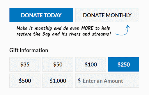
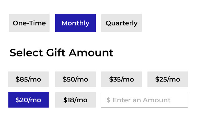
Personalize your ask string.
If you are not already customizing your ask strings based on a donor’s giving history, you should start now! Using their past giving history to customize the ask string allows you to:
- Limit your donor’s ability to downgrade themselves.
- Ask for a giving level the donor will feel comfortable with.
Studies show that larger ask strings and higher default donation amounts, like the pre-selected $250 gift amount in the example below, incentivize donors to contribute more due to the anchoring effect*. These findings have been thoroughly tested in behavioral economics and through our case studies.
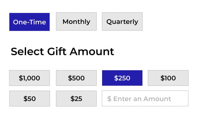
*Anchoring Effect is a cognitive bias that describes people’s tendency to rely too heavily on the first piece of information offered (the “anchor”) when making decisions. During decision-making, anchoring occurs when individuals use an initial piece of information to make subsequent judgments.
Invest in a cost-effective online donation platform.
By leveraging a donation platform’s out-of-the-box form functionality, you should be able to achieve a relatively smooth and easy donation process for your supporters. Build on that foundation by simplifying the donation process.
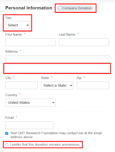
Remove unnecessary form fields.
Studies have shown that simplifying donation forms increases conversion rates. Therefore, we recommend removing any unnecessary form fields. Do not ask for information that is not required to process their gift or that you don’t have a plan for using.
Every additional field you include on your donation form is a potential stumbling point for your donors. Limit the total number of non-required fields. If you do ask for non-required information, be sure that you already have a plan for how to use that information going forward. If you don’t have a plan for that info, don’t include the field.
Below are examples of form fields that could be removed:
Identify errors in real time.
Your form should perform error validation in real-time (i.e., client-side) rather than waiting for the donation processor to catch all possible errors. The error messages should guide your supporters through fixing their errors so they can complete their donations successfully.
A rejected credit card due to insufficient funds can only be triggered by your payment gateway when they try to process the gift. However, there are other types of errors you can identify the moment they occur, such as:
- Skipping over a required field: Immediately highlight that field on the form and trigger an error message (e.g., “Please enter your first name.”)
- Entering a non-numeric value as their donation amount: Trigger a message stating that only numbers are allowed in this field.
- Entering an invalid email address: If they type in an email address that doesn’t match a standard pattern for email addresses (e.g., they forget to include an ‘@’ symbol), trigger a simple error message asking them to verify their email.
By handling these errors in real time, you are making fixing the issues much quicker and easier for your supporters, making it much more likely that they will complete their donations.
You can also capture these errors in your Google Analytics account. Perhaps you are seeing the same or similar errors over and over again. Capturing these errors gives you an opportunity to fix problems sooner than later.
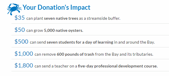
Tell the donor the impact their gift will make.
Include a brief statement on your donation form to let the donor know how their gift will impact your mission.
In this example, the donor can see how their impact increases with the donation amount.:
NOTE: You’ll need to write unique copy for specialty forms like Giving Tuesday and End-of-Year associated with those campaigns.
Ask the donor to cover the payment processing fee.
Give donors the option to add 3% to their gift to cover processing fees. In our clients’ experience, almost half of the users opt to add the processing cost to their donation amount.

Remove the navigation bar.
Studies have shown that reducing internal and outbound links on donation forms increases conversion rates. Minimize internal and outbound links, including removing main navigation links.
Customize the text on the form fields and donation button.
Instead of using the word “Other” on your ask string, use copy that is more encouraging, like
- “Choose how much you can give.”
- “Enter your best gift.”

Test alternative copy on your Submit button, such as:
- “Donate”
- “Donate Now”
- “Contribute”
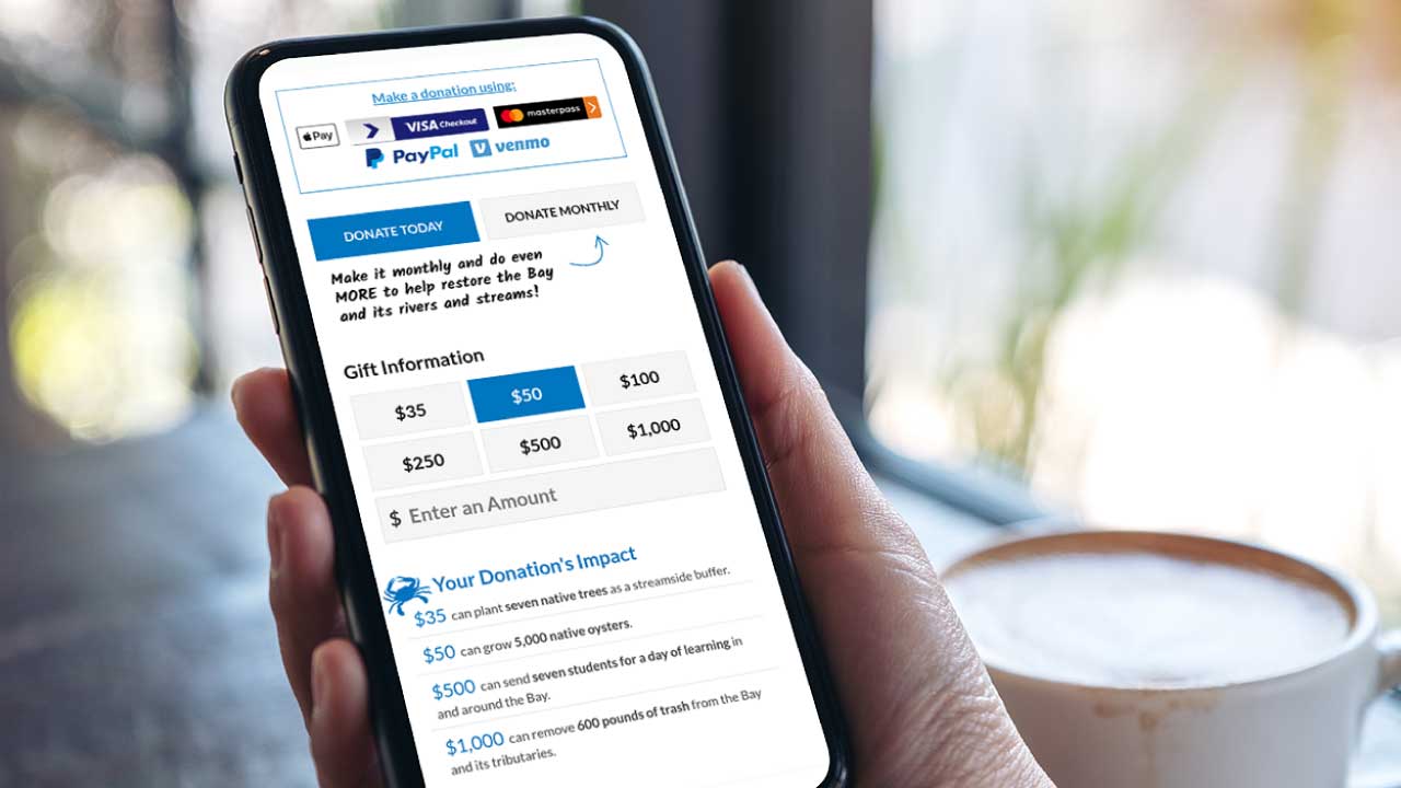
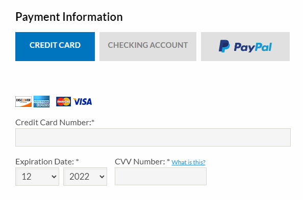
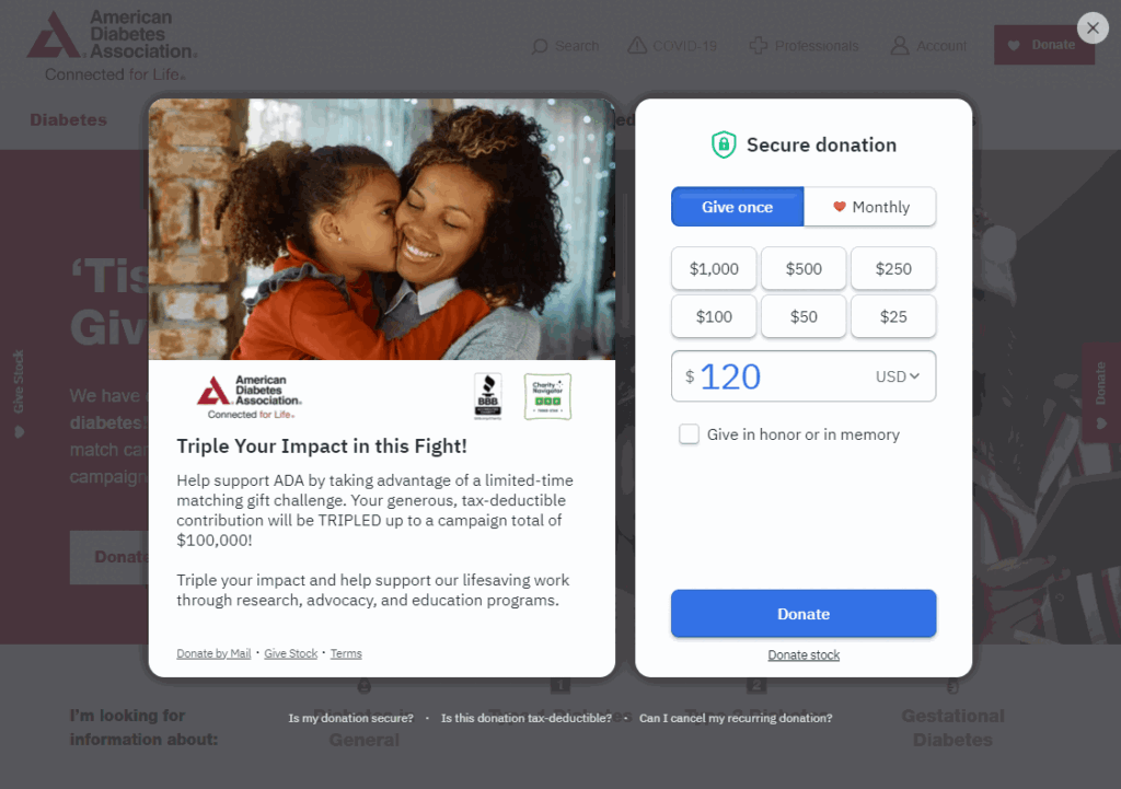
Offer multiple payment options.
Your organization may have compelling reasons for not accepting certain forms of payment (e.g., exorbitant processing fees, non-compatibility with your eCRM, etc.), but you should offer donors as many payment options as possible.
Google, Apple Pay, and PayPal integrations benefit the donor’s overall user experience. It increases the ease of making donations and is a great integration to incorporate, especially for younger donors.
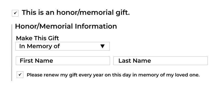
Offer Honor/Memorial cards.
Including Honor/Memorial Cards on your donation page incentivizes people to make Honor/Memorial donations. We have found these donors to be particularly important for health and disease organizations. The Honor/Memorial option and cards should be located directly below the one-time/monthly option.

Emphasize sustainer giving.
Recurring donations are one of the best ways to increase your donor retention and online fundraising revenue.
Add a sustainer call-out to draw attention.
Implement a call-out like the one below to encourage a recurring donation. Make it stand out by using a different font and an arrow directing the donor to click the recurring giving button.
Offer Sustainer Frequency Options.
Allegiance Group + Pursuant recommends including various frequencies.
The donation amounts should change to be appropriate for monthly giving.
Include a testimonial.
Include donor quotes and quotes from people positively impacted by your services or from celebrities and industry experts as social proof.
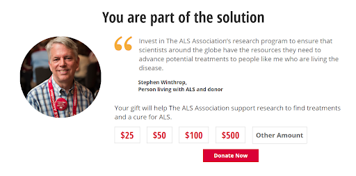
A photo and a quote combined can draw a potential donor to identify with the present need and situation and then compel a visitor to donate.
Embed Calls-to-Action.
Creating an embedded site-wide banner in the website header containing a donation call to action will bring attention to the importance of contributing and increase the prominence of donation asks on all pages, including the homepage.
Embed teaser forms on your other web pages.
Teaser forms allow website users to select a donation amount and start the donation process on any website page. They’re a fantastic way to ask for a donation once people finish reading an article on your website.

Below are two examples of teaser forms:

Optimize the load time of your donation page.
Load time is the time it takes for all the content on your page to display, including images, videos, and text. Maintaining a rapidly loading page is crucial for user experience and search engine optimization (SEO).
If a page takes too long to load, prospective donors will abandon the page. Mobile pages take even longer to load than their browser-based counterpart. To avoid losing prospective donors, ensure your donation page loads quickly on mobile and desktop browsers.
According to a study by Portent, a 0-4 second load time is best for conversion rates, and the first five seconds of page-load time have the highest impact on conversion rates.
Google reports that by compressing images and text, 25% of pages could save more than 250KB, and 10% can save more than 1MB (which contributes to page load times).
Various websites offer tools to test your page load time.
- dotcom-tools.com/website-speed-test
- tools.pingdom.com/
- debugbear.com/test/website-speed
- gtmetrix.com/
Make your donation page mobile-responsive.
According to Oberlo, mobile users account for over 60% of all web traffic.
Mobile-friendly donation pages are essential for online fundraising.
Mobile-responsive pages should have the following features:
- A single-column layout
- Drop-downs when possible
- Adequately spaced clickable elements
- Large, clearly labeled buttons
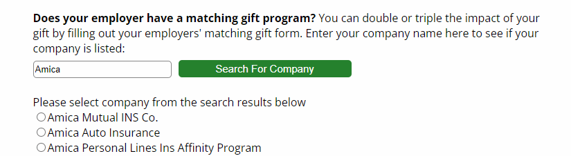
Include a corporate matching gift search feature.
Over 26 million individuals work for companies with matching gift programs. 78% of donors eligible for matching gifts are unaware of their employer’s matching gift program. Integrating your donation platform with Double the Donation allows you to embed an employee lookup on your donation form to capture those corporate matches.
Ensure accessibility.
Like all organizations open to the public, nonprofits must make reasonable accommodations to allow people with disabilities to access their services.
An inaccessible donation form will exclude potential donors.
Accessible donation forms should have the following:
- Labels that are screen reader compatible
- Adequate color contrast
- Clear instructions
- Errors that are easy to find and fix
- Keyboard navigation
- Text alternatives (alt text) on images.
Here are some valuable resources to help you check your site’s accessibility.:
Whoisaccessible.com offers a Web accessibility checklist.
ada.gov/resources/web-guidance/ describes how you can ensure your website is accessible to people with disabilities.
WebAim Contrast Checker (Input the color codes for your background and foreground, and you’ll get a Pass or Fail per the guidelines).
Design with white space.
White space is exactly what it sounds like – white space on a form that allows users to focus on the text and other elements of a donation form, creating balance on the form.
One of the less apparent benefits of white space is that it improves readability and understanding of the actions a person should take on a webpage. Allowing for white space in your donation form design will help users of all ages, especially older ones. It makes reading the message easier and gives their eyes a clear direction on what is next.
Conclusion
Implementing these best practices via your fundraising software to create a great experience for your donors is the best path to online fundraising success. Happier donors mean improved retention rates, increased average gifts, and higher lifetime value. Not only that, but they are more likely to praise and recommend your organization to friends and family, thereby broadening your supporter base and setting you up for long-term success.